3 Ways to Make Copy and Pictures Play Nice Together
By Sue Stoney, Writer-Editor-Writing Coach, and Dan Riccio, Senior Graphic Designer
Having had a many-year professional relationship in the field of marketing, we feel we are uniquely qualified to talk about how words and pictures not only can, but should, work well together, no matter what venue you’re using them in – online or offline.
Let the pictures equal their thousand words, not replace them
When you use graphics (photographs, screenshot captures, diagrams, pie charts…) in a communication piece, use them judiciously. They are part of what communicators call “rubrics” (that is, they stand out from the text like the directions written in red in the books used by the priest in old-time liturgy). Because they stand out, they offer you a perfect opportunity to catch the reader’s eye.
Graphics should advance the story the text is trying to tell. No pictures just for pictures’ sake. In a print ad or on a marketing web page, for example, a clear-resolution screen capture of a smart phone is just a pretty picture – unless the screen on the phone shows your application at work on it. The copy that accompanies it should be describing the benefits to the user of YOUR app on YOUR smart phone. Voila – a great marriage of words and pictures to move your story forward.
Use the right format for the venue, so readers see what’s in the graphic
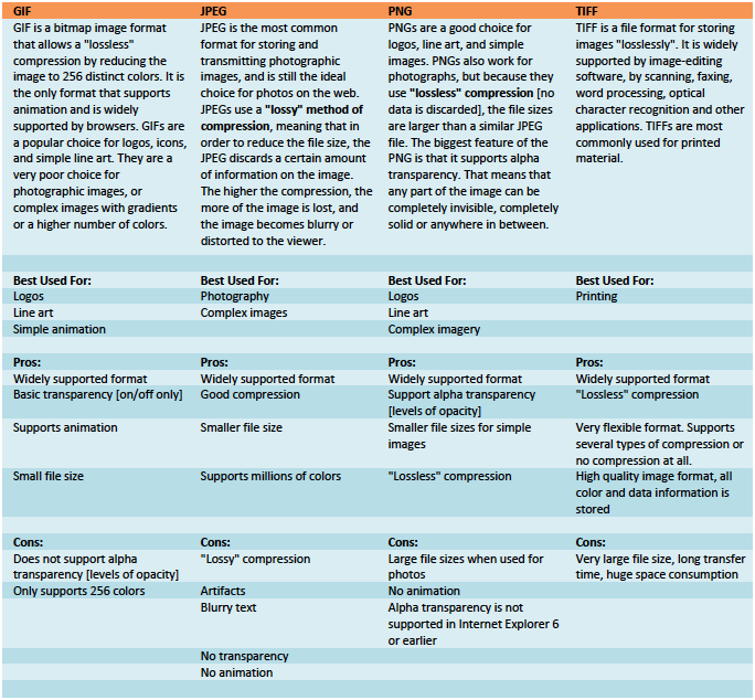
There is no point in pointing to a graphic no one can see the detail in. When you only have a picture that has that grain-y look that will make your readers squint, you might want to leave it out altogether. File formats that graphics should be saved in, based on the venue in which you plan to use them, include:
Interweave text and graphics, so they work hand-in-glove with the story
A photograph of the person conducting the seminar correlates more closely with the copy you’ve written about that seminar if the copy flows around the photo. If page layout constraints mean that you can’t juxtapose the words telling the story with the picture illustrating it, consider putting an action caption under the photo and referencing the picture in the copy.
In screenshot captures, using text callouts that point to the application’s features are an excellent way to show AND tell how the app will benefit the purchaser. It lets the prospective buyer of your product see how well it will work for him or her.
Tables with column headings that “talk to each other” are a way to pull illustrations into the copy. If the column heading says “Feature”, a picture of the feature on the product next to the feature’s name is perfect for those who think visually. If you include a “Benefit” column next to the “Feature” column in the table, you can use the words to market the “What’s in it for me?” to the reader for that feature.
Why making words and pictures work together is better than not…
The words you write and the graphics you put with them work best together, each doing what they do in connection – not cross purposes – with each other. William Blake, in the late 1700s and early 1800s, understood this well – his poems were never meant to be read without the illustrations, nor the illustrations seen without the poems. Something in each alone was made clearer when coupled with the other. Getting your words AND pictures to advance your story will help you achieve your communication goal efficiently.

 Sue Stoney has been a writer, editor and writing coach for 20 years and Dan Riccio has been a graphics designer for 15. They have been collaborating on words and pictures for more than 10 years.


Leave a Reply